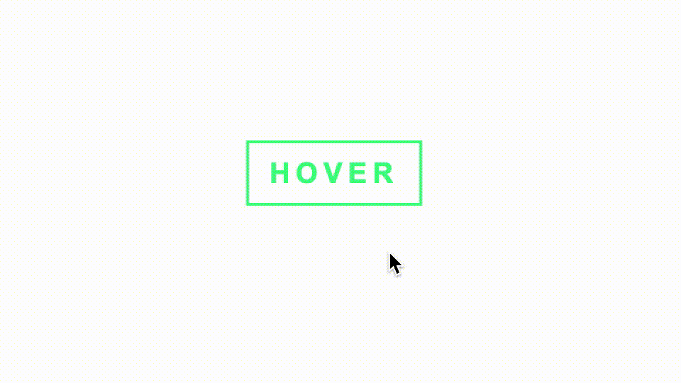
悬停代码小瀑布按钮
适用于科技感的网站中,此按钮有助于增加网站的科技感效果。
核心代码部分,简要说明了写法思路;完整代码在最后,可直接复制到本地运行。
知识点:
1️⃣ transition 过渡属性
2️⃣ animation 动画属性
3️⃣ :nth-child(n) 和 :hover 选择器
4️⃣ -- 自定义属性(css变量)以及 var(...) 引用自定义属性值函数和 calc(...) 计算属性值函数
思路:基于上一例代码瀑布加载动画,实现鼠标悬浮在按钮上方时,显示出其代码瀑布动画。
核心代码
html 代码
<div class="btn-box80"> <button class="btn80">HOVER</button><div class="loading80"><p class="p80">4rs<span class="i80-1">b</span>h<span class="i80">k</span>r</p><p class="p80">_7u<span class="i80">i</span>90<span class="i80">@</span>v</p><p class="p80">_7,=<span class="i80-1">j</span>ud<span class="i80">i</span>y</p><p class="p80">d8<span class="i80-1">%</span>rg</p><p class="p80"><span class="i80">d</span>oopd<span class="i80-1">e</span>g</p><p class="p80">c4*<span class="i80-1">h</span>ld</p><p class="p80">u<span class="i80">g</span>_^43<span class="i80">2</span>iu</p></div></div>
按钮开关主体代码结构。
CSS部分代码
.btn-box80{width:124px;height:46px;position: relative;display: flex;justify-content: center;align-items: center;cursor: pointer;--color-f:#43ff85;--color-s:#6c72fe;--color-t:#f7e543;}.btn80{width:124px;height:46px;font-size:20px;font-weight: bold;letter-spacing:4px;outline: none;background-color: transparent;border:2px solid var(--color-f);color:var(--color-f);position: absolute;padding:0;cursor: pointer;z-index:1;transition: all 0.24s linear;}.loading80{width:124px;height:46px;font-size:24px;font-weight: bold;letter-spacing:4px;background-color: transparent;position: absolute;left:-2px;overflow: hidden;cursor: pointer;z-index:0;opacity:0;transition: opacity 0.24s linear;}.p80{cursor: pointer;writing-mode: vertical-rl;letter-spacing:3px;font-size:12px;line-height:1;margin:0;padding:0;position: absolute;color:var(--color-f);--left:3px;--delay:0.1s;animation: eff80 0.6s linear infinite;}.i80{color:var(--color-s);}.i80-1{color:var(--color-t);}.p80:nth-child(1){left:var(--left);}.p80:nth-child(2){left:calc(var(--left)+18px);animation-delay:var(--delay);}.p80:nth-child(3){left:calc(var(--left)+18px*2);animation-delay:calc(var(--delay)*2);}.p80:nth-child(4){left:calc(var(--left)+18px*3);}.p80:nth-child(5){left:calc(var(--left)+18px*4);animation-delay:calc(var(--delay)*4);}.p80:nth-child(6){left:calc(var(--left)+18px*5);animation-delay:calc(var(--delay)*3);}.p80:nth-child(7){left:calc(var(--left)+18px*6);}@keyframes eff80{0%{transform:translateY(-40%);}100%{transform:translateY(140%);}}.btn-box80:hover.btn80{text-shadow:02px0var(--color-s);box-shadow:2px2px0var(--color-s),-2px-2px0var(--color-t);}.btn-box80:hover.loading80{opacity:1;background-color:#000000;}
这里在上一例的基础上,增加了按钮样式,利用 :hover 来显示隐藏代码瀑布动画。
完整代码
html页面
<!DOCTYPE html><html lang="zh"><head><meta charset="utf-8">
<title>悬停代码小瀑布按钮</title>
<style>
.app{width:100%;height:100vh;background-color:#ffffff;position: relative;display: flex;justify-content: center;align-items: center;}.btn-box80{width:124px;height:46px;position: relative;display: flex;justify-content: center;align-items: center;cursor: pointer;--color-f:#43ff85;--color-s:#6c72fe;--color-t:#f7e543;}.btn80{width:124px;height:46px;font-size:20px;font-weight: bold;letter-spacing:4px;outline: none;background-color: transparent;border:2px solid var(--color-f);color:var(--color-f);position: absolute;padding:0;cursor: pointer;z-index:1;transition: all 0.24s linear;}.loading80{width:124px;height:46px;font-size:24px;font-weight: bold;letter-spacing:4px;background-color: transparent;position: absolute;left:-2px;overflow: hidden;cursor: pointer;z-index:0;opacity:0;transition: opacity 0.24s linear;}.p80{cursor: pointer;writing-mode: vertical-rl;letter-spacing:3px;font-size:12px;line-height:1;margin:0;padding:0;position: absolute;color:var(--color-f);--left:3px;--delay:0.1s;animation: eff80 0.6s linear infinite;}.i80{color:var(--color-s);}.i80-1{color:var(--color-t);}.p80:nth-child(1){left:var(--left);}.p80:nth-child(2){left:calc(var(--left)+18px);animation-delay:var(--delay);}.p80:nth-child(3){left:calc(var(--left)+18px*2);animation-delay:calc(var(--delay)*2);}.p80:nth-child(4){left:calc(var(--left)+18px*3);}.p80:nth-child(5){left:calc(var(--left)+18px*4);animation-delay:calc(var(--delay)*4);}.p80:nth-child(6){left:calc(var(--left)+18px*5);animation-delay:calc(var(--delay)*3);}.p80:nth-child(7){left:calc(var(--left)+18px*6);}@keyframes eff80{0%{transform:translateY(-40%);}100%{transform:translateY(140%);}}.btn-box80:hover.btn80{text-shadow:02px0var(--color-s);box-shadow:2px2px0var(--color-s),-2px-2px0var(--color-t);}.btn-box80:hover.loading80{opacity:1;background-color:#000000;}
</style>
</head>
<body><div class="app"><div class="btn-box80"><button class="btn80">HOVER</button><div class="loading80"><p class="p80">4rs<span class="i80-1">b</span>h<span class="i80">k</span>r</p><p class="p80">_7u<span class="i80">i</span>90<span class="i80">@</span>v</p><p class="p80">_7,=<span class="i80-1">j</span>ud<span class="i80">i</span>y</p><p class="p80">d8<span class="i80-1">%</span>rg</p><p class="p80"><span class="i80">d</span>oopd<span class="i80-1">e</span>g</p><p class="p80">c4*<span class="i80-1">h</span>ld</p><p class="p80">u<span class="i80">g</span>_^43<span class="i80">2</span>iu</p></div></div></div></body></html>
以上就是所有代码,以及简单的思路,希望对你有一些帮助或者启发。
[广告]赞助链接:
关注数据与安全,洞悉企业级服务市场:https://www.ijiandao.com/
让资讯触达的更精准有趣:https://www.0xu.cn/
 关注KnowSafe微信公众号
随时掌握互联网精彩
- MongoDB在Debian上如何进行集群搭建
- 腾讯推出智能工作台ima.copilot
- WebOS酷似windows11风格的web私有云网盘
- JavaScript vs WebAssembly:哪个更节能、更快?
- 色彩的生命力|骁龙影像赏
- BCS2022技术峰会:高对抗环境下网络新攻防
- 『直播中』从unidbg trace log中还原被ollvm混淆的非标准算法
- “为报复公司解雇,我更改了项目的所有代码注释!”
- 高通发明家|Ananth Kandhadai:专注于信号处理和计算机视觉领域,助力开拓智能终端新时代
- 解锁一辆车的非“优雅”方式
- 安全“天团”齐聚蓉城,CSO论坛共话安全
- SSL证书有多少类型 都是多少钱?


